Enhancement for Integrations
Refining the Integrations experience in Tawk.to so it is easier to discover, understand and configure, and consistent across the whole product.
Overview
A scalable, consistent home for every integration.
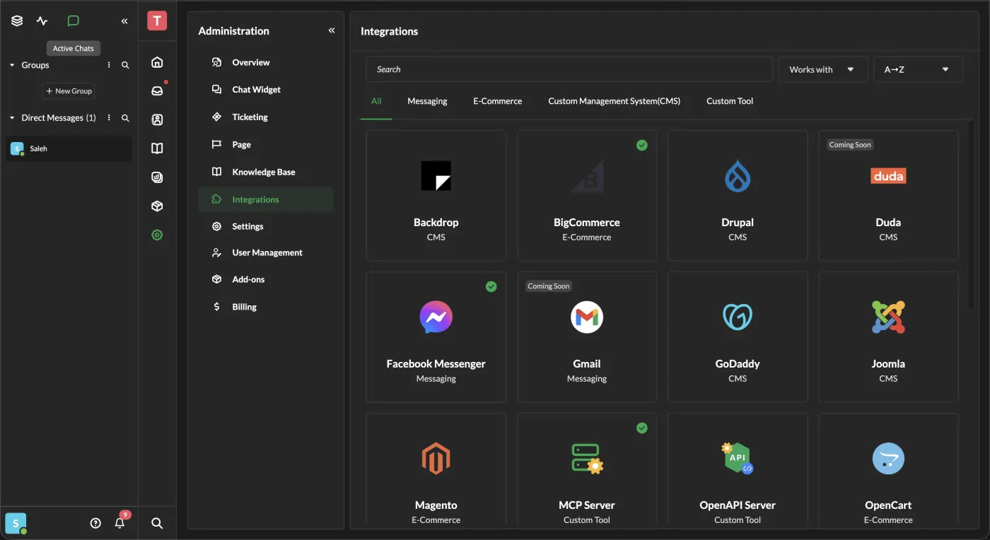
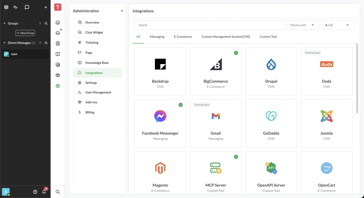
The Integrations module connects businesses with external services, channels and productivity tools. I refined usability and visual consistency and built a scalable foundation for future integrations, aligned with the evolving Tawk.to design system.
- My roleUX evaluation, unified components, prototypes, and design QA with FE and QA
- ScopeIntegrations module and design system
The challenge
Inconsistent patterns made integrations hard to scan and trust.
Reviewing the existing UI, user feedback and QA reports surfaced inconsistent patterns, confusing categories and weak hierarchy. Integrations were hard to browse, and it was unclear how they connected to Inbox, Contacts and Channels.
- 01Inconsistent UI patterns across different pages
- 02Unclear category grouping causing confusion
- 03Weak visual hierarchy made scanning difficult
- 04Cards lacked essential info, and small screens felt cluttered
What users needed
- Predictable browsingA simple, predictable way to browse and locate integrations.
- Clear purposePlain explanations of what each integration actually does.
- ConsistencyThe same layout and behavior across the whole Tawk.to ecosystem.
- Fast setupQuick access to set up or manage any integration.
Audit → IA → System → QA
How I approached it
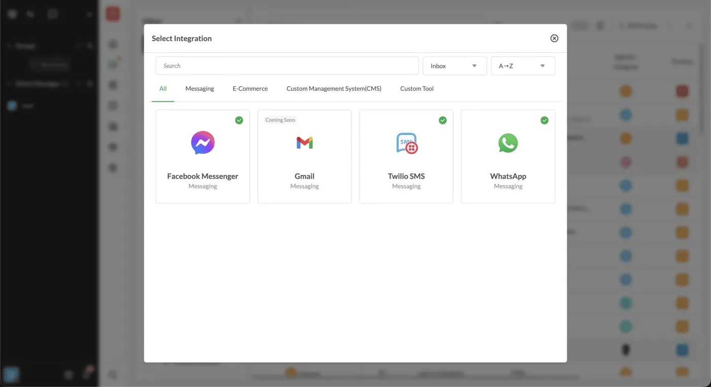
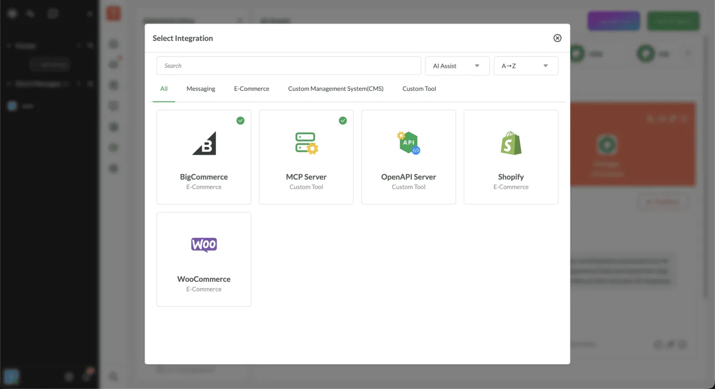
The solution
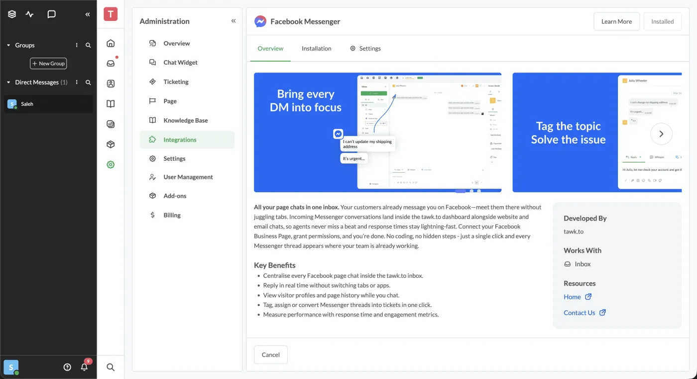
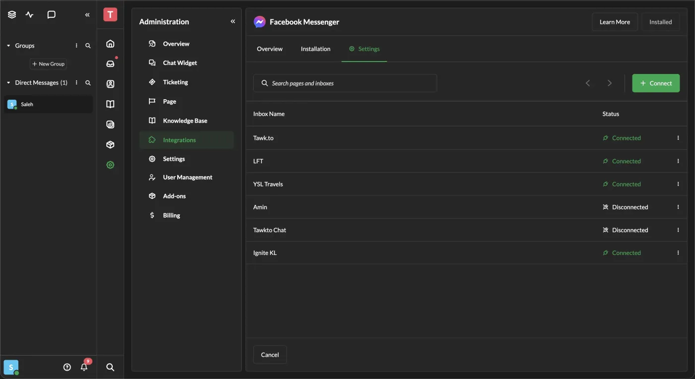
Unified integration cards, clearer categories and better search bring order to a growing list, consistent across dark and light themes and the rest of the product.
Outcome
Integrations became easier to find, understand and scale.
The real work was systemic: turning one-off screens into reusable components with consistent behavior, so the experience holds up as more integrations are added. The refined module shipped into the live product.
Screens