Hotels.com
Elevating the booking experience through a strategic mobile redesign: simpler navigation, a modern dark interface, and pricing that is clear before checkout.
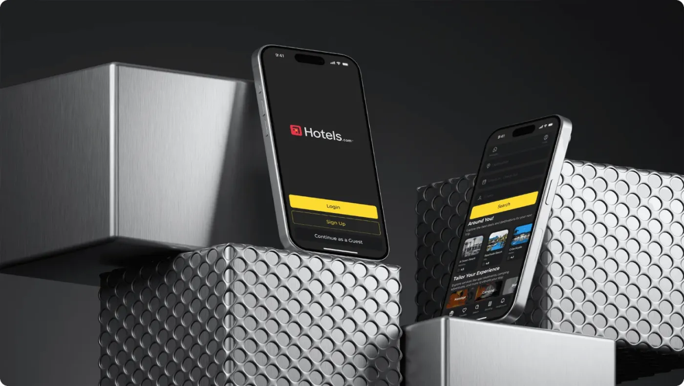
Overview
A mobile app redesign focused on the moment that matters most: booking.
The project reworked the Hotels.com mobile app to improve the booking flow and the overall experience for travelers. The goal was a more modern, intuitive and visually appealing interface, benchmarked against the best of Airbnb and Booking.com.
- My roleUX research, IA, UI design, hi-fi prototypes, handoff
- ToolsFigma
The challenge
The old app buried key actions and lost people at checkout.
- 01Navigation made search, booking and profile hard to find
- 02Cluttered layout pulled focus from the important actions
- 03Outdated visuals made the app feel dated
- 04Checkout confusion around fees and booking conditions
Design objectives
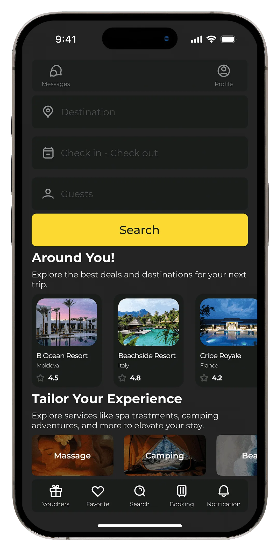
- Streamline navigationExplore, search and book without confusion, with key areas one tap away.
- Modern visual hierarchyBold typography, consistent elements and imagery-led screens.
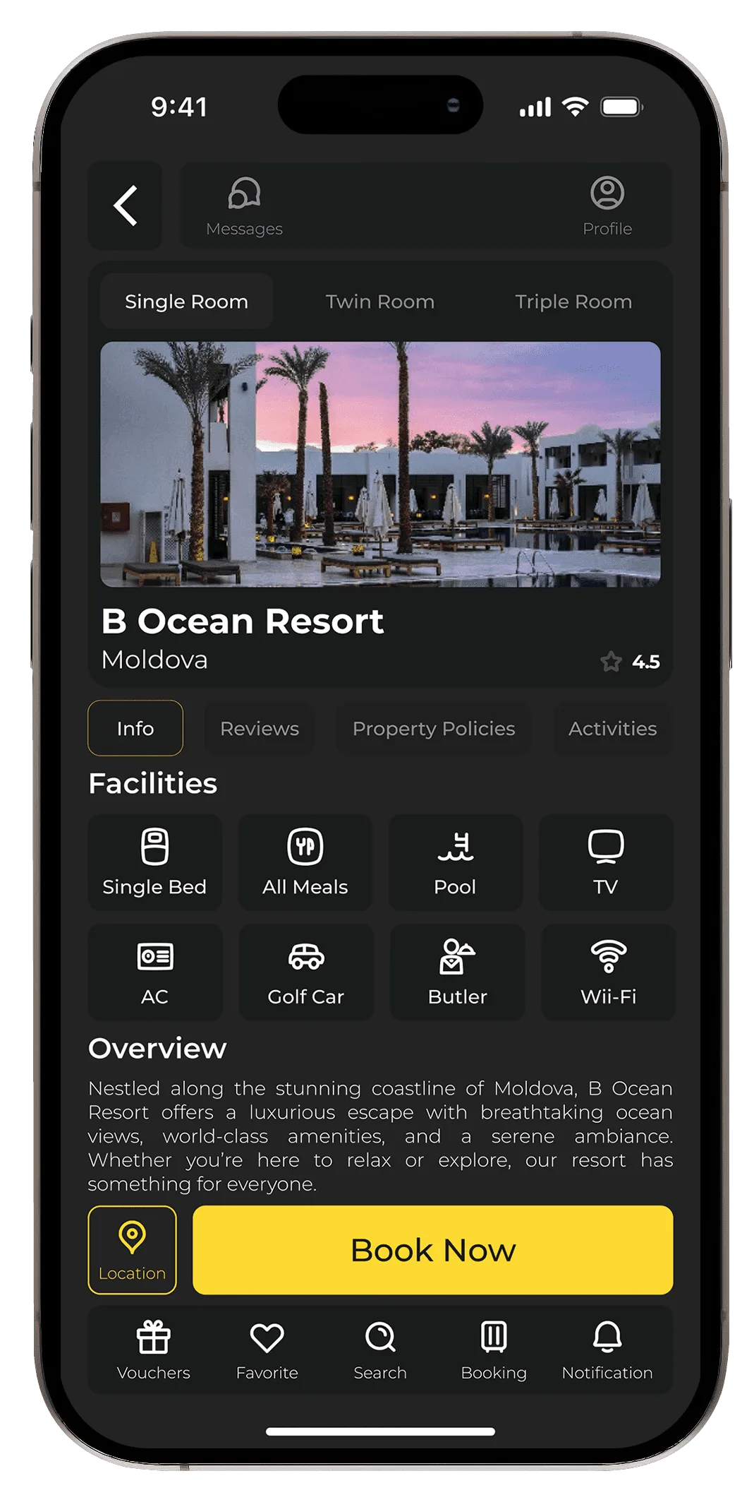
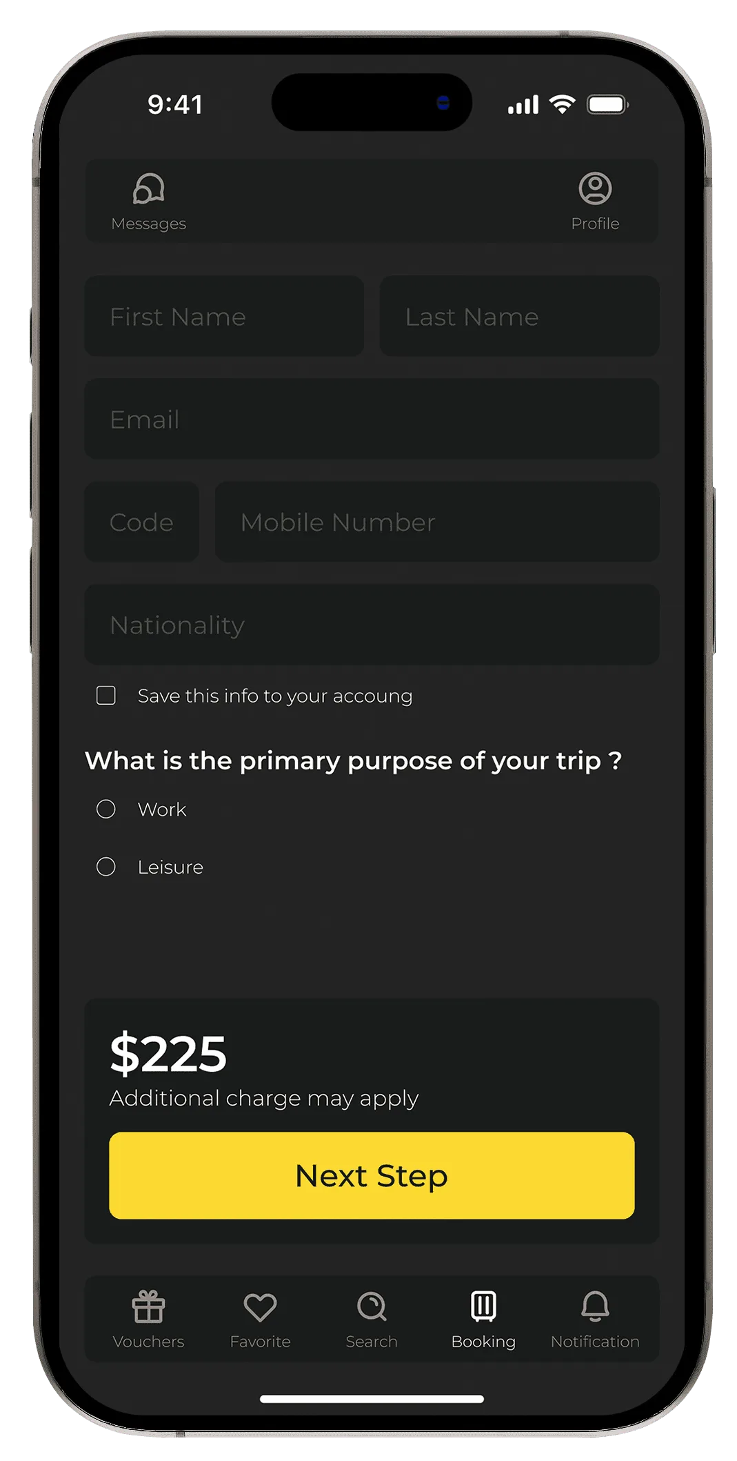
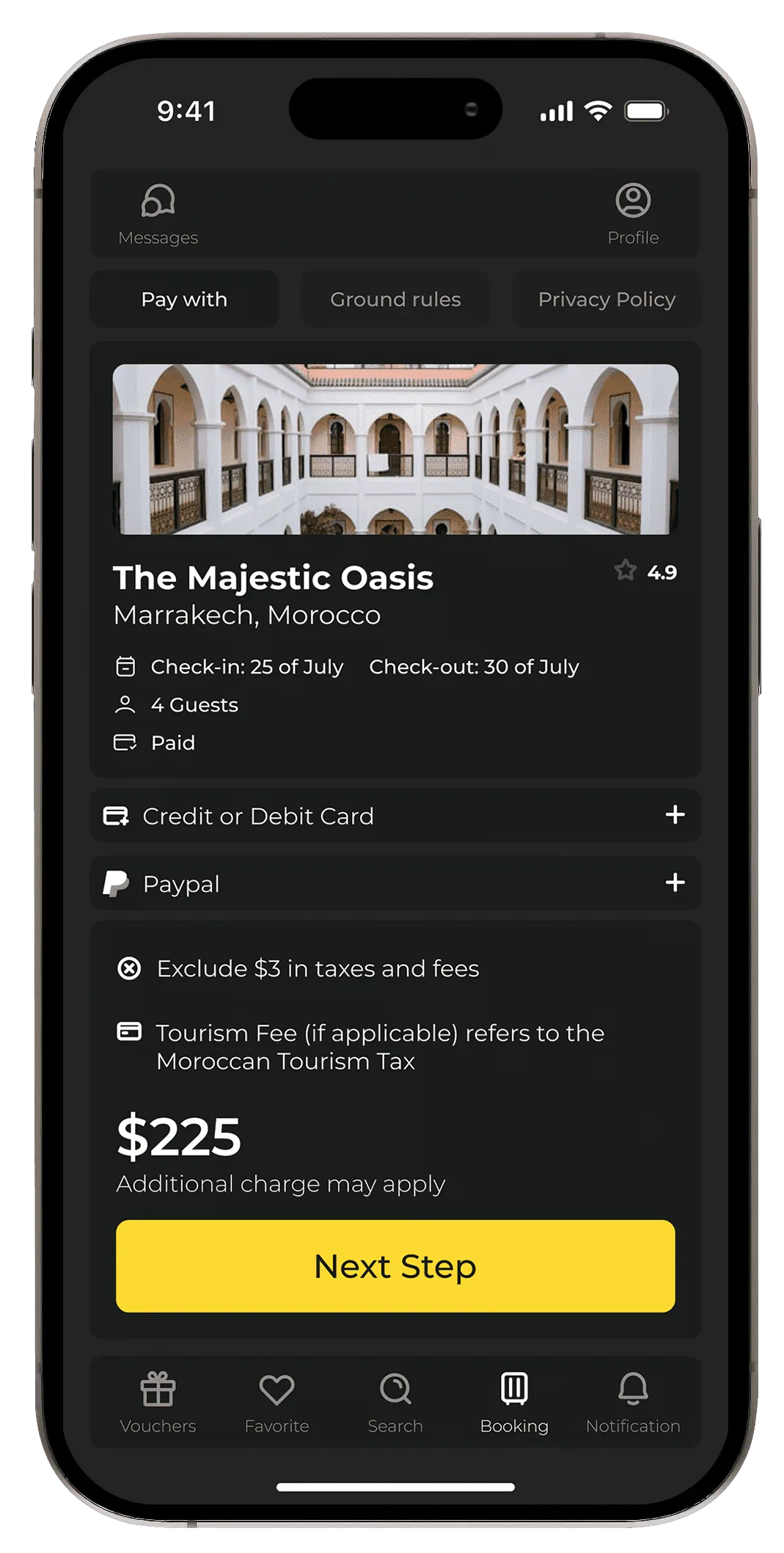
- Clear bookingA simpler checkout with upfront pricing and plain conditions.
- PersonalizationRecommendations shaped by past searches and preferences.
Dark base · one bright CTA · Montserrat
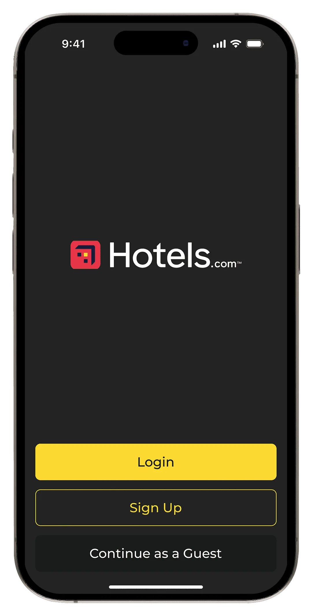
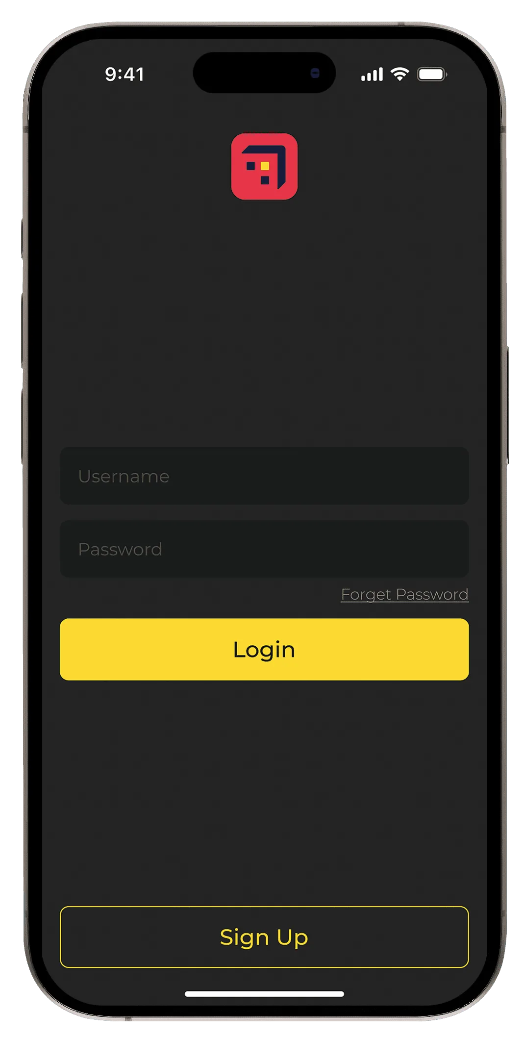
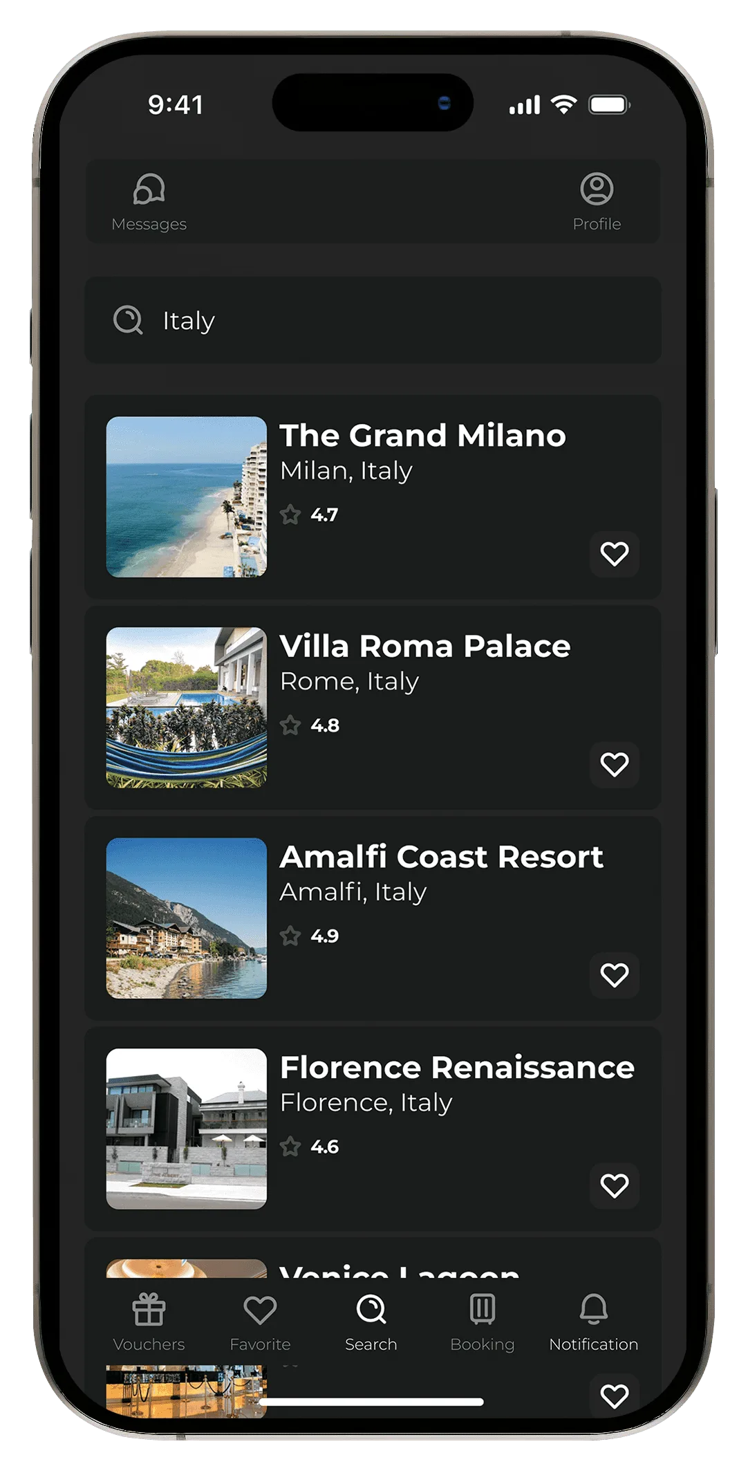
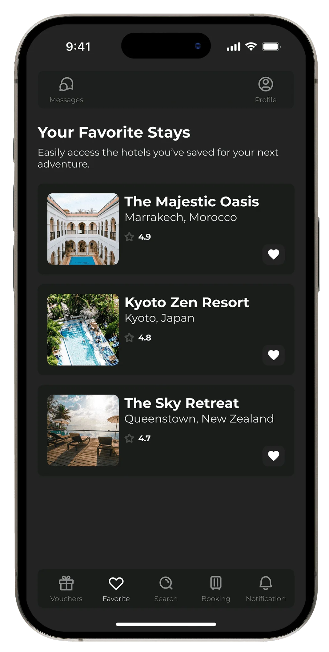
A streamlined bottom nav, a dark theme with a single bright call to action, immersive hotel imagery, and a checkout that shows fees and conditions before you commit.
- Background#242424
- Primary CTA#FCD931
- Secondary#1A1C1B
- MontserratBold → Light
Outcome
The redesign tested as a clear improvement in navigation, clarity and the booking journey.
The dark theme was the hardest part to get right: keeping enough contrast for readability and accessibility took rigorous testing of the palette. Next steps I would explore are voice search for bookings and deeper loyalty-program integration to lift retention.
- More engagementPeople spent longer exploring hotels thanks to the clean, visual layout.
- Lower drop-offFewer people abandoned booking once the checkout flow was simplified.
- Higher satisfactionFeedback praised the clear pricing and the modern, smoother experience.
Screens