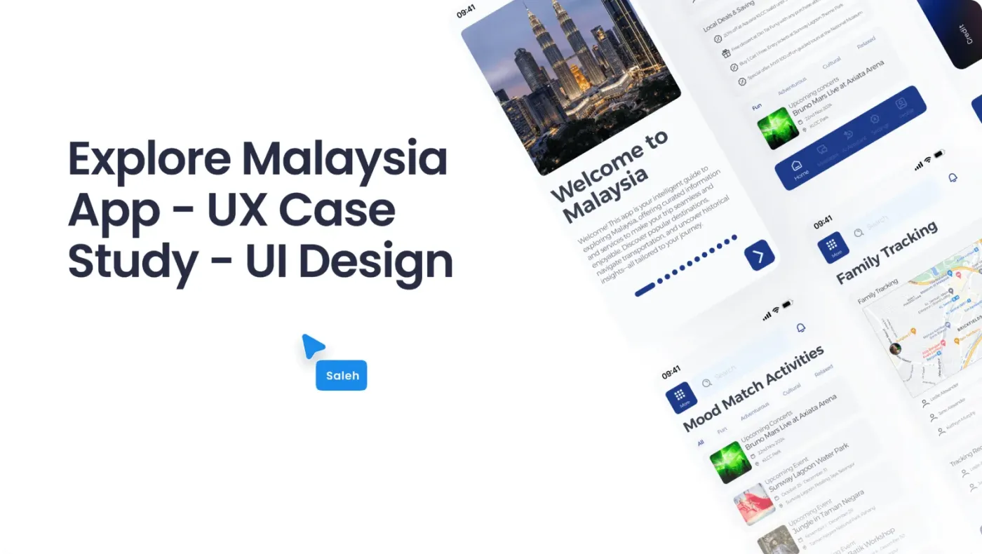
Problem
A visitor lands and installs a dozen apps to do the basics: get out of the airport, pay for things, keep the family together, work out where they are. Every one of them assumes local knowledge they do not have yet.
In interviews with frequent visitors the same obstacles came up around time, money and safety. People wanted one official app instead of assembling services they had never heard of.
Research
The survey ranked their worries for me.
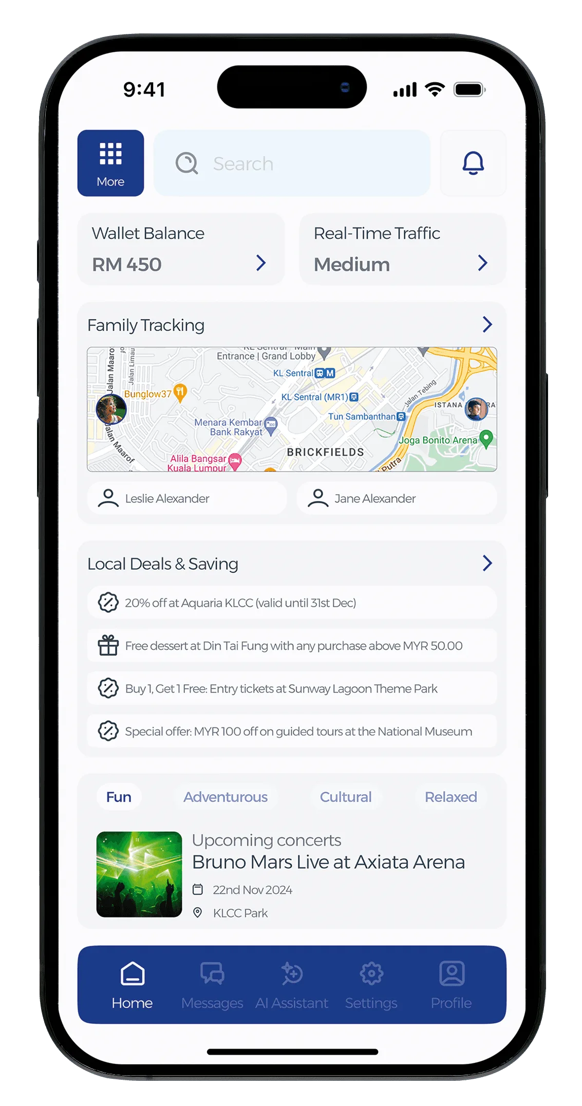
I interviewed frequent visitors and ran a survey on what makes a trip stressful. Budget came first by a wide margin, then having an official source, then family safety. The home screen follows that order.
Process
- DISCOVERVisitor interviews, arrival-journey mapping, audit of the 12 apps tourists actually install
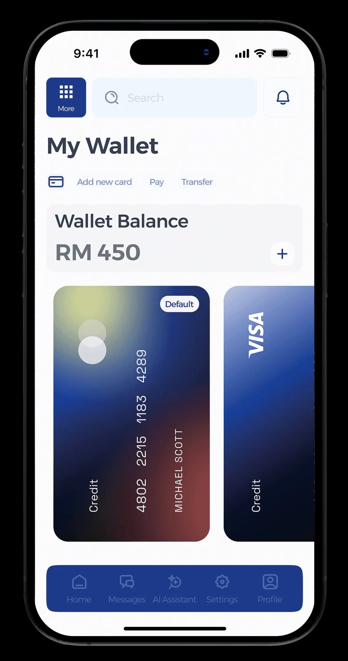
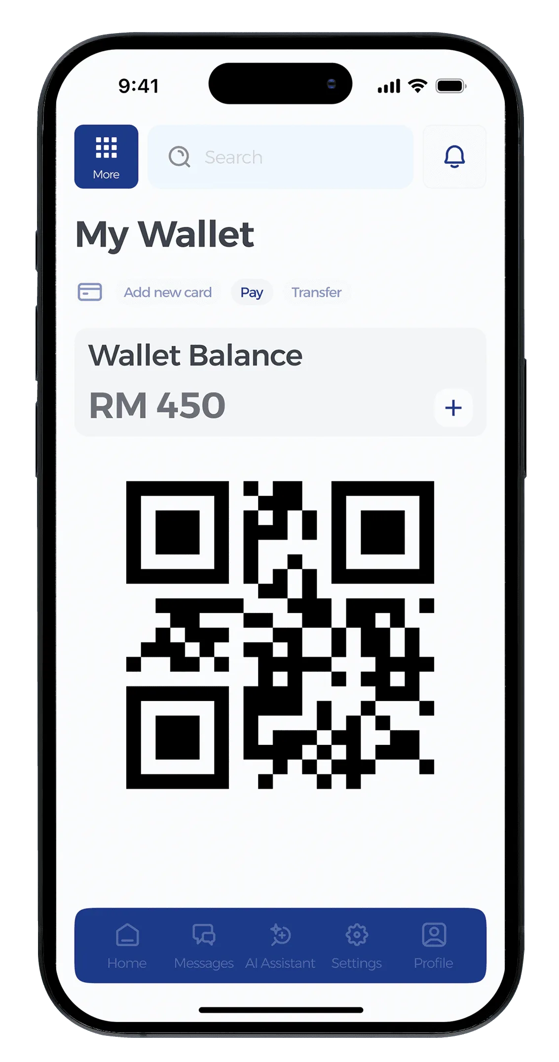
- DEFINEModular home ranked by research priorities; wallet and traffic first
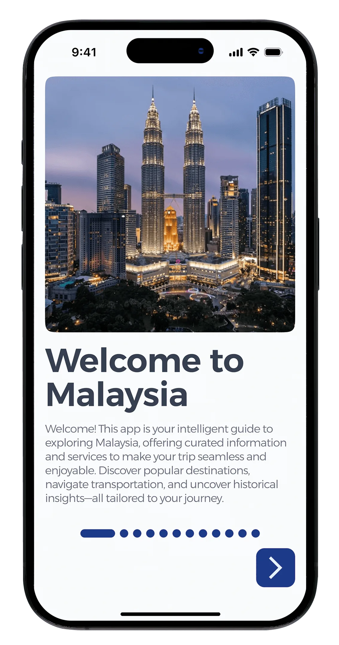
- DESIGNPhotography-led UI, guided first use for every module
- VALIDATETwo usability rounds; tutorials, icon clarity and tracking privacy came out of them
- SHIPEight services delivered with night mode and accessible contrast
Decisions
A modular home, ranked by what visitors worry about.
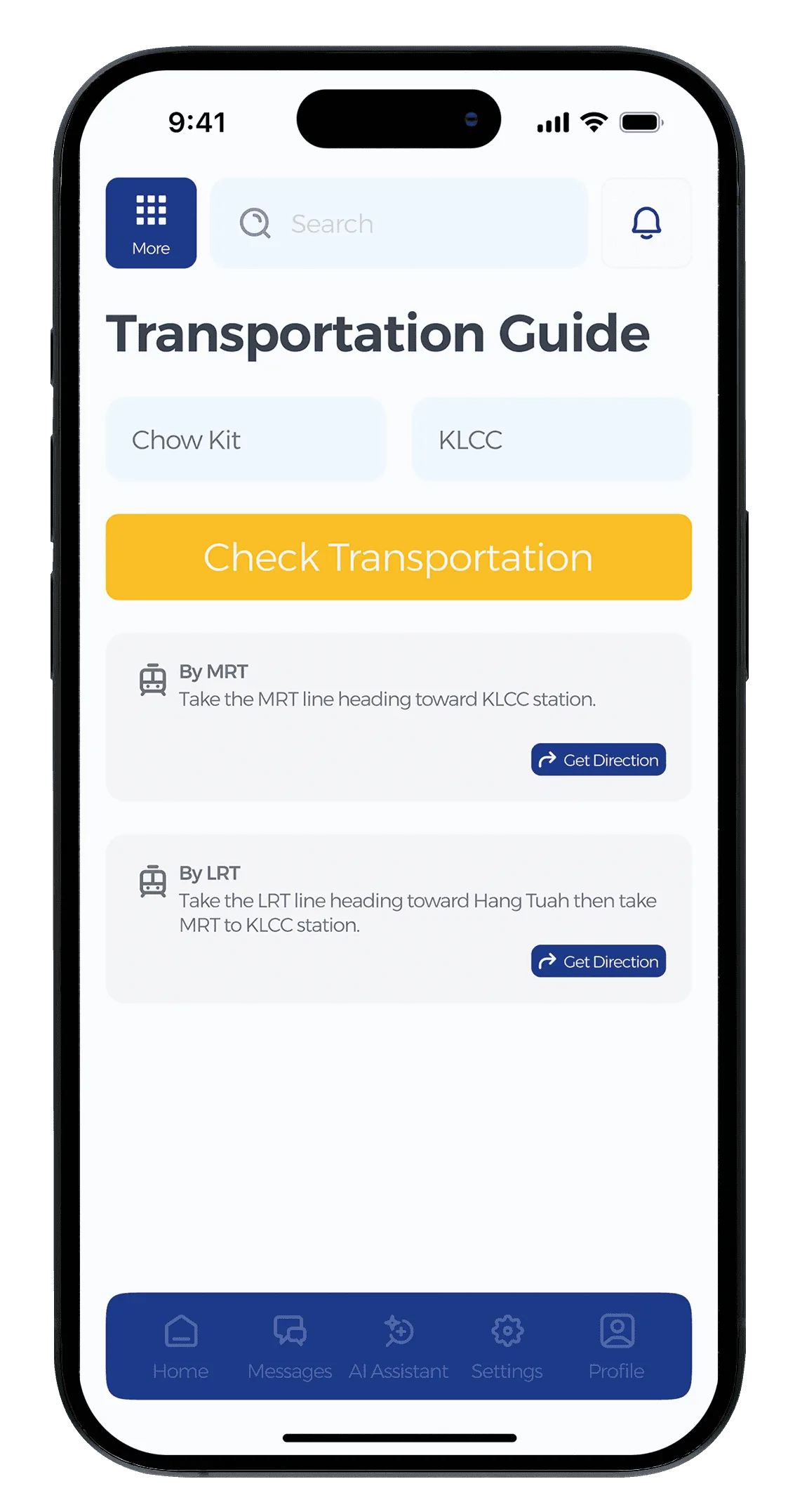
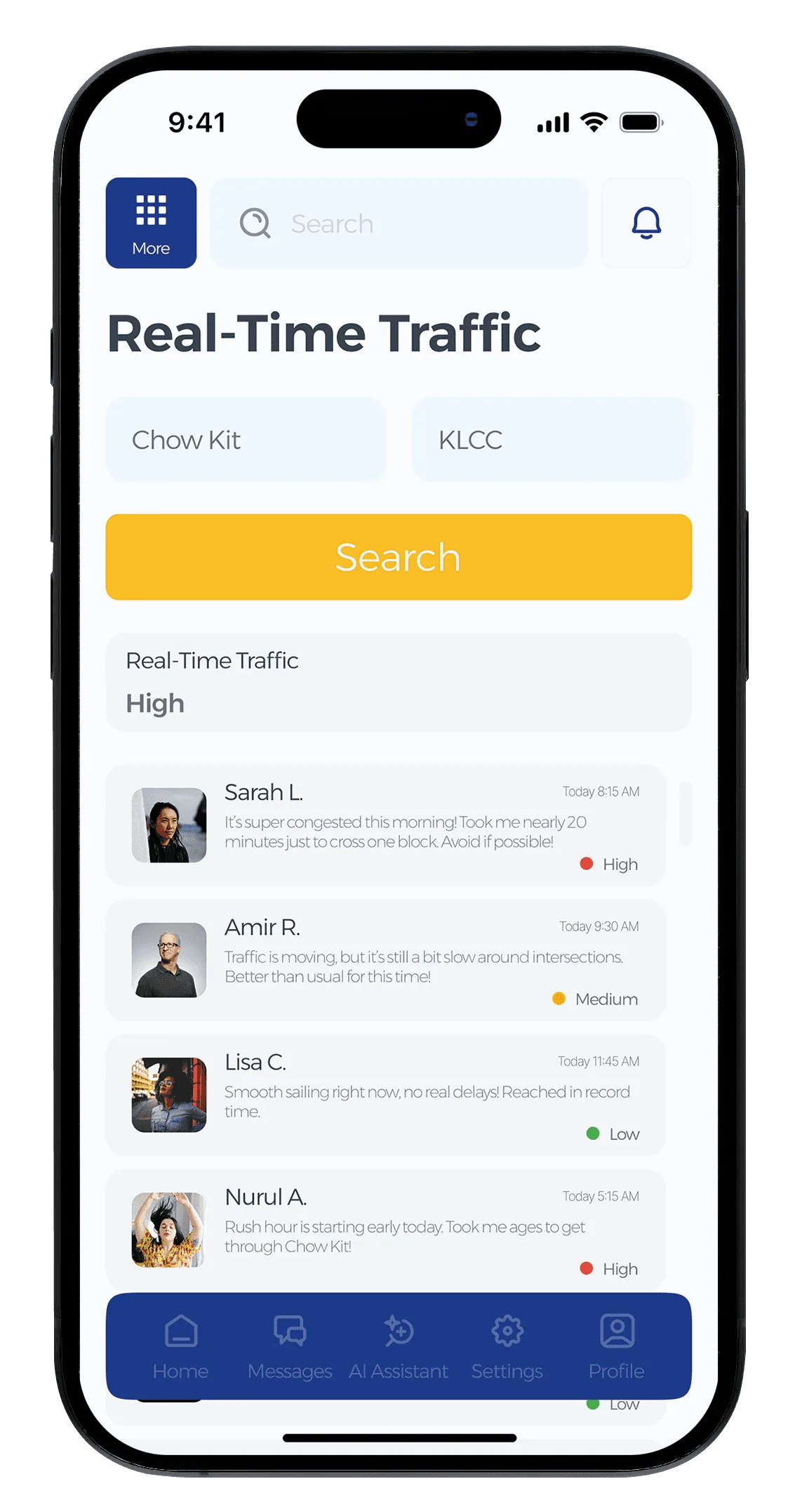
Wallet, traffic, transport and family tracking sit one tap from home, in the order the research put them.
Tourism marketing lost the first screen. An app earns its trust by being useful on day one.
Guided first use for every service.
Photography-led onboarding introduces a feature the first time it opens, rather than all of them at install.
More screens to design and maintain. It fixed the lost feeling testers described in the first round.
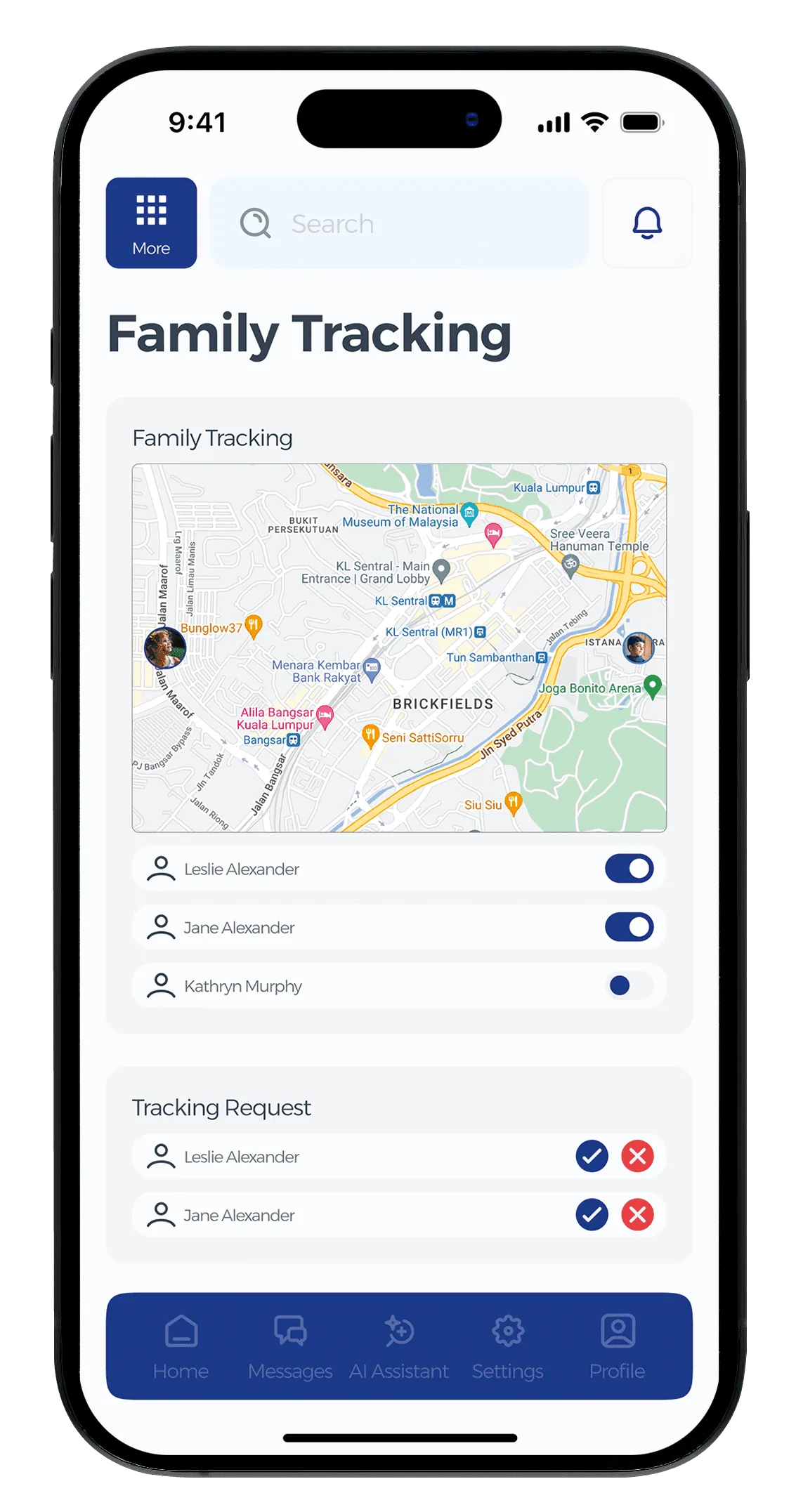
Family tracking asks first.
Explicit consent, sharing status you can see at a glance, and controls that take one tap to reach.
Turning sharing on takes a few more taps. A government app cannot afford to feel like surveillance.
PrototypeTap the glowing hotspots to move through the app, like the real prototype.
Before → After
A dozen local apps in unfamiliar languages, no official source, and a visitor guessing at costs and routes on day one.
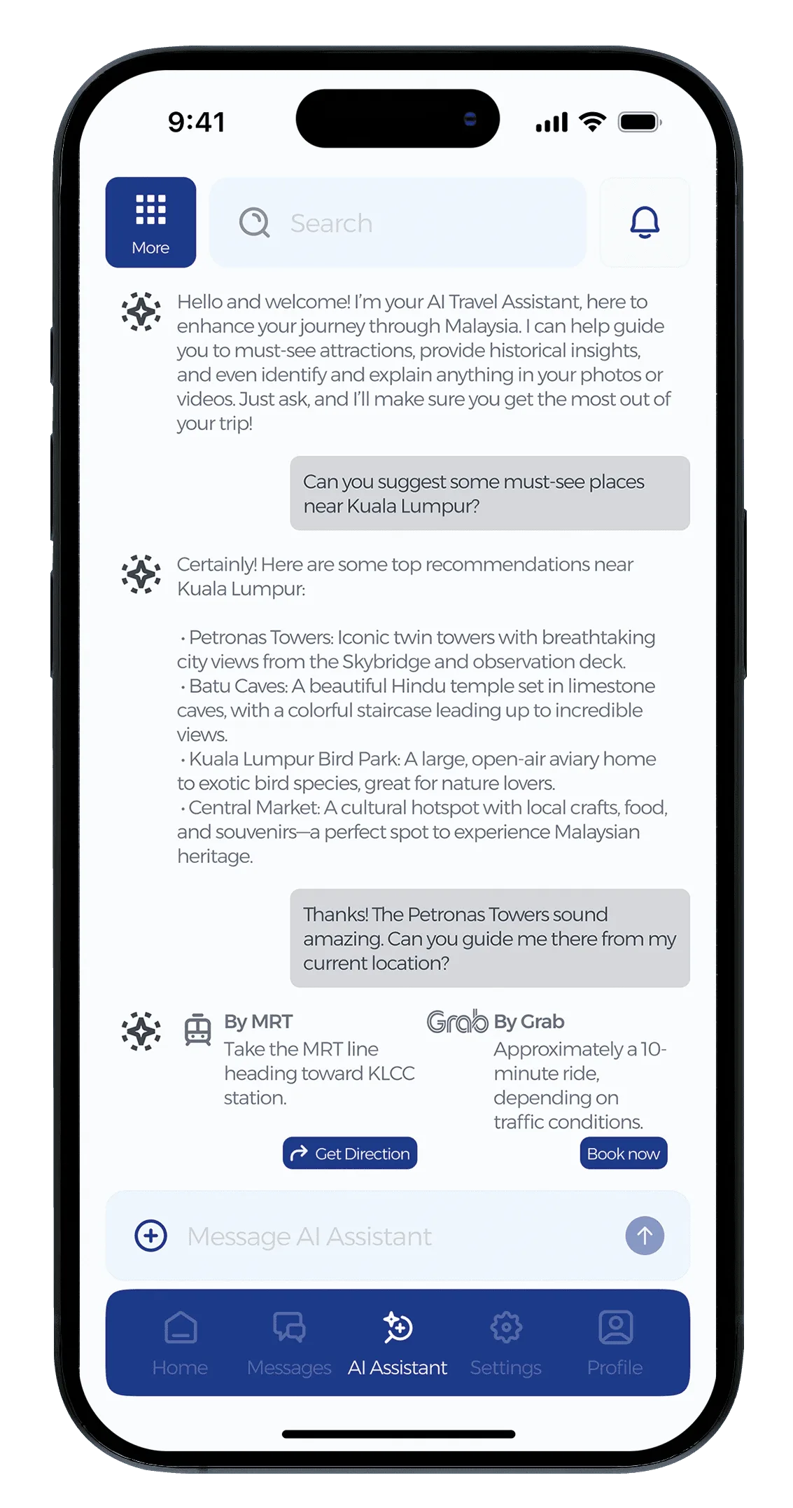
One government-backed app: costs upfront, routes live, family visible, and a guide that answers in the visitor’s own language.
Outcome
- Testers asked for tutorials, so every service now explains itself the first time it opens.
- Family tracking felt exposed in round one, so consent and clearer controls went in before round two.
- Night mode came out of testing too, for long days out, and holds accessible contrast.
Reflection
The hard part was restraint. A super app can bury someone on their first day abroad, and both rounds of testing pushed the same way: explain each service as it opens, make the icons obvious, and use photography people recognise.